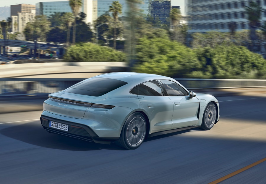


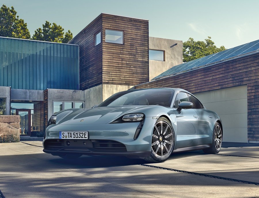

It was only in September that Porsche’s first all-electric sportscar had its global debut – on 3 continents simultaneously – and now, the company is presenting the third version – the Taycan 4S.
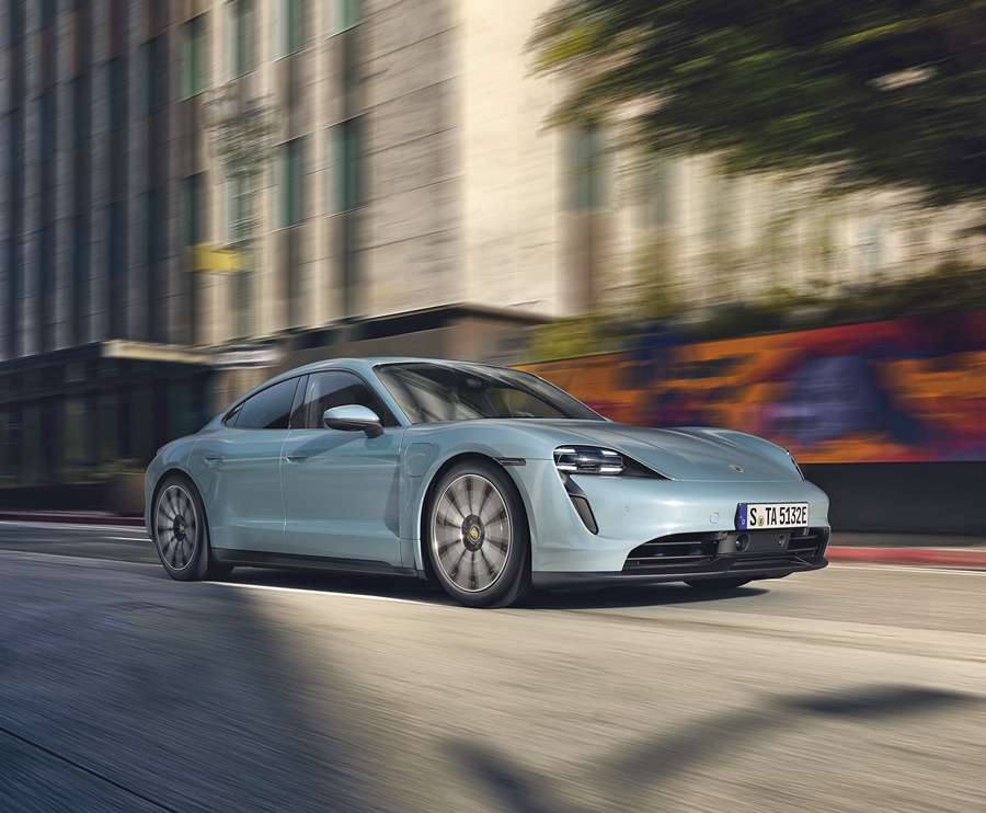
Puristic exterior design
The clear, puristic design of the Taycan signals the beginning of a new era. At the same time, it retains the unmistakable Porsche design DNA. The sleek cabin, the drawn-in rear C-pillar and the pronounced shoulders of the wings result in a sharply emphasized rear, typical of the brand. There are also innovative elements such as the glass-effect Porsche logo, which has been integrated into the light bar at the rear.
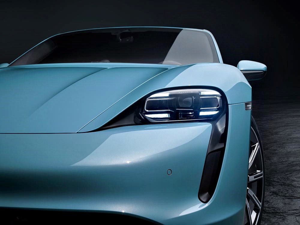
Distinguishing features of the Taycan 4S compared with the Turbo and Turbo S include the aerodynamically optimized 19-inch Taycan S Aero wheels and the red-painted brake calipers. The front apron with new geometry, side sills and rear diffuser in black also give further visual differentiation. LED headlights including Porsche Dynamic Light System Plus (PDLS Plus) are standard.
This version is available with two battery sizes; with the Performance Battery, up to 390 kW/530 ps and with the Performance Battery Plus, up to 420 kW/571 PS. Following the Taycan Turbo S and the Taycan Turbo, the Taycan 4S is therefore the new entry-level model in the series.
A single-deck Performance Battery with a total capacity of 79.2 kWh comes as standard. The two-deck Performance Battery Plus familiar from the Taycan Turbo S and Taycan Turbo is optionally available. The total capacity here is 93.4 kWh.
For both variants, the claimed 0 to 100 km/h time is 4.0 seconds. The top speed is 250 km/h in both cases but the claimed range is up to 407 kms with the Performance Battery and up to 463 kms with the Performance Battery Plus – the highest of the current Taycan range.
Dynamic performance
The permanently excited synchronous machine on the rear axle has an active length of 130 mm and is therefore exactly 80 mm shorter than the corresponding drive component on the Taycan Turbo S and Taycan Turbo. The pulse-controlled inverter used on the front axle in the Taycan 4S operates with up to 300 amps, and the inverter on the rear axle with up to 600 amps.
With two permanently excited synchronous machines on the front and rear axles – in other words, all-wheel drive – as well as a 2-speed transmission on the rear axle, the drive architecture comprises the same main technical highlights as the other versions.
The same also applies to the intelligent charging management and exemplary aerodynamics. With a Cd of 0.22, the aerodynamics makes a significant contribution to low energy consumption and thus long range.
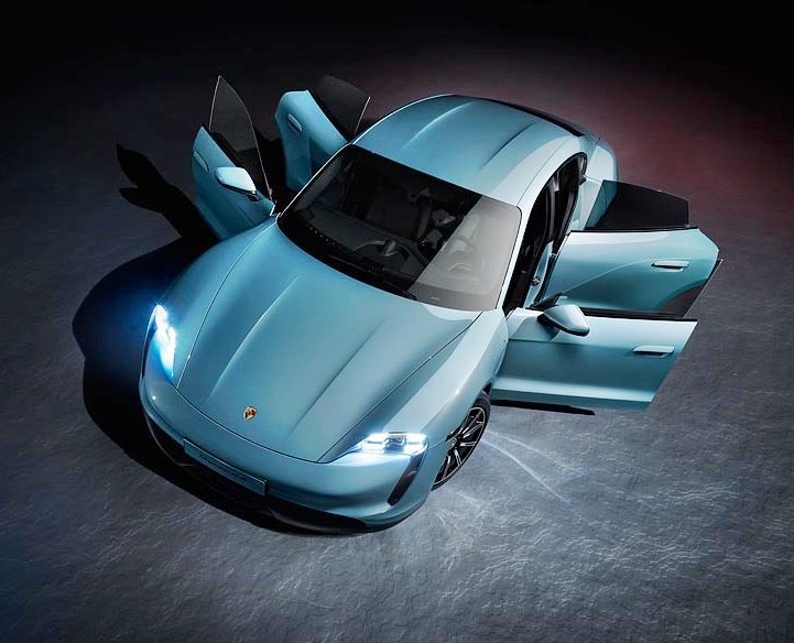
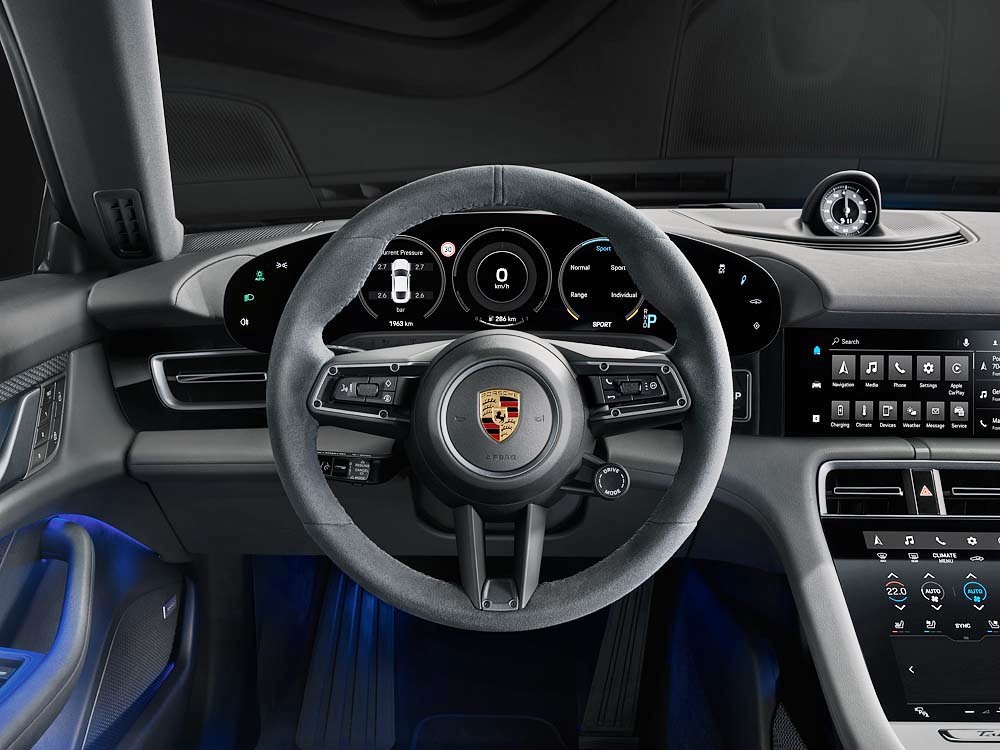
Unique interior design
The cockpit also signals the start of a new era with its clear structure and completely new architecture. The free-standing, curved instrument cluster forms the highest point on the dashboard. This places a clear focus on the driver axis. A central 10.9-inch infotainment display and an optional passenger display are combined to form an integrated glass band in a black-panel look.
As standard, the Taycan 4S comes with a partial leather interior as well as front comfort seats with 8-way electrical adjustment. However, with the Taycan, Porsche also offers an entirely leather-free interior for the first time, for customers who have such a demand. Interiors made from innovative recycled materials underscore the sustainable concept of the electric sportscar.
Porsche uses a centrally networked control system for the Taycan chassis. The integrated Porsche 4D Chassis Control analyses and synchronises all chassis systems in real time. As standard, the Taycan 4S features adaptive air suspension with three-chamber technology including electronic damper control PASM (Porsche Active Suspension Management).