The UX or User Experience for the driver of today’s cars is a very important aspect that interior designers pay a lot of attention to. Not only does it make a difference to motoring pleasure but also has major influence on safety. With the rapid increase in electronic systems and graphic displays, the UX must be as efficient as possible and also intuitive so that it makes life easier, rather than confusing.
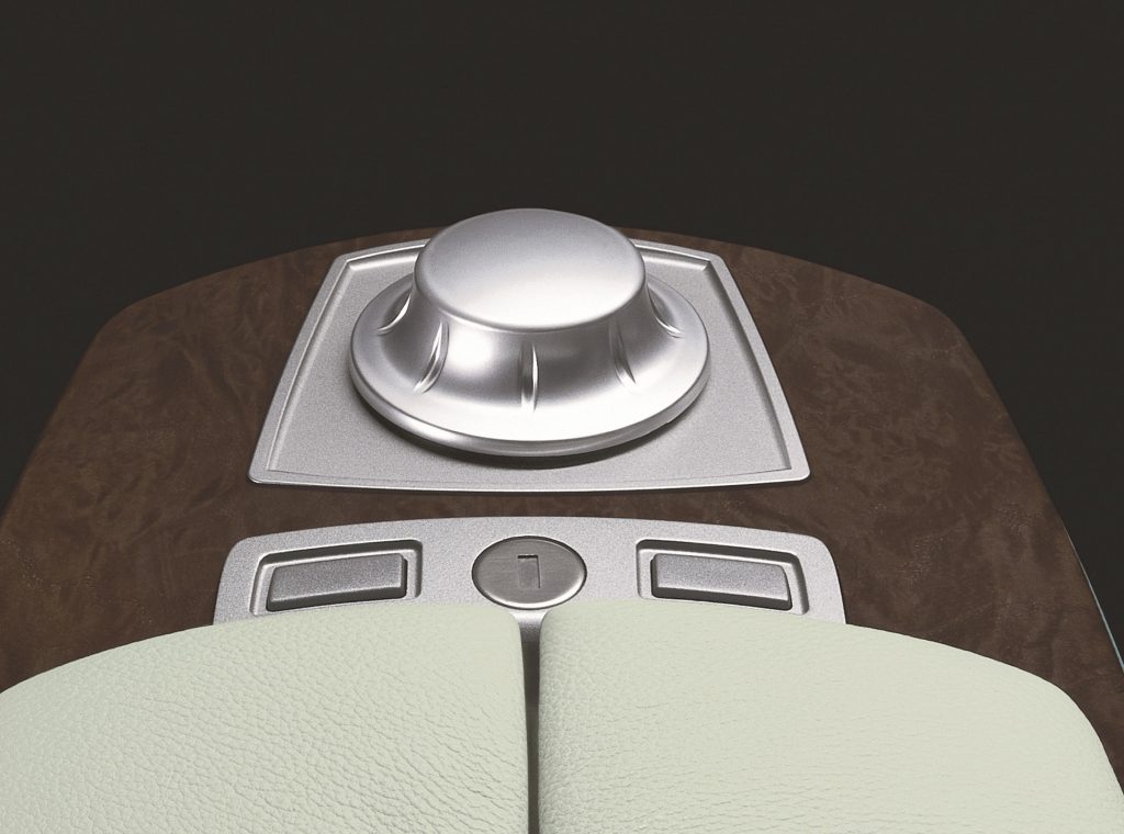
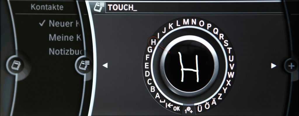
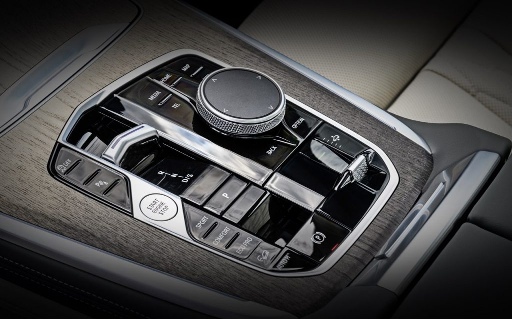
When BMW introduced the iDrive system some 20 years ago, it gave the driver a new way to manage what would come to be called the infotainment system on a display panel in the middle of the dashboard. Instead of having an array of switches and buttons on the dashboard to operate various functions, there was a rotary controller which worked somewhat like a computer mouse.
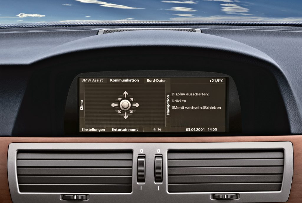
In fact, the iDrive approach adapted some elements of a computer screen and menu, and it was assumed that with computers being commonly used by most people, such an approach would provide a familiar touch. In concept, it was innovative but in execution, the first generation of the iDrive received criticisms in some areas and was even felt to be distracting.
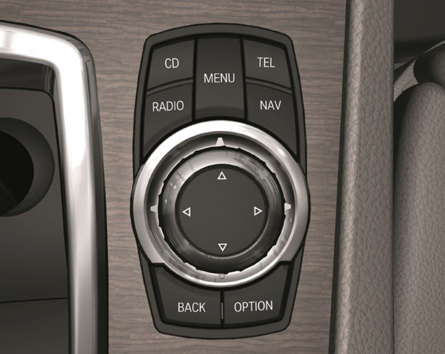
Removing the many switches and knobs was one thing but the controller was too separated from the screen and the driver was expected to operate it without looking at it, while driving. Obviously, it was impractical to expect the driver to pull to the side each time he wanted to make some adjustment. In time, drivers did get used to operating the controller without looking at it.
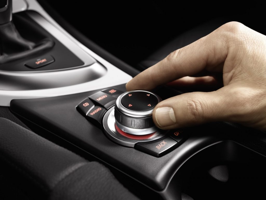
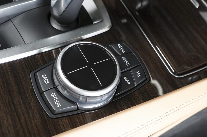
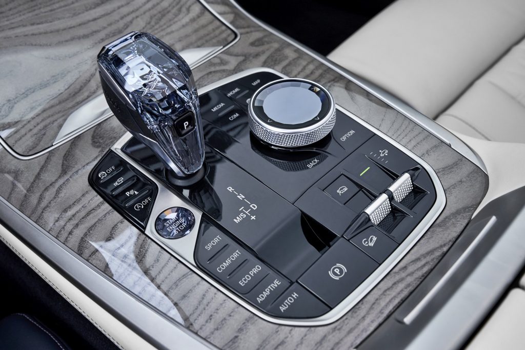

But then there was the problem of the menu structure which had too many layers. In some cases, the driver would have to click a few times to go through a few sub-menus. That meant looking at the screen – taking eyes off the road ahead which is a no-no when it comes to safe driving. Perhaps the idea worked in aircraft displays but an aircraft in the air is not in a space where it is likely to crash into another plane, unlike a car cruising along an autobahn.
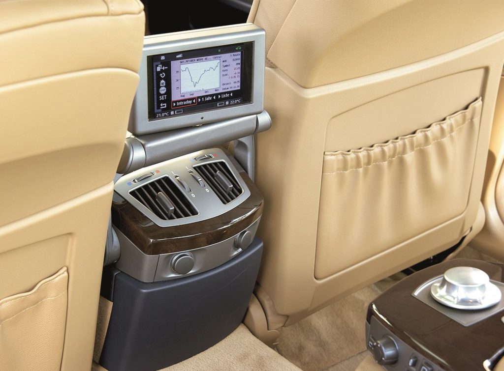
BMW, of course, took in all the feedback and as it evolved through 8 generations, many of the early issues were eliminated. The input was also revised in various ways; in 2007, for example, supplementary programmable buttons were added on the dashboard to handle some functions that used to be done with the controller. New hardware with faster processing power and more memory also improved performance over time.
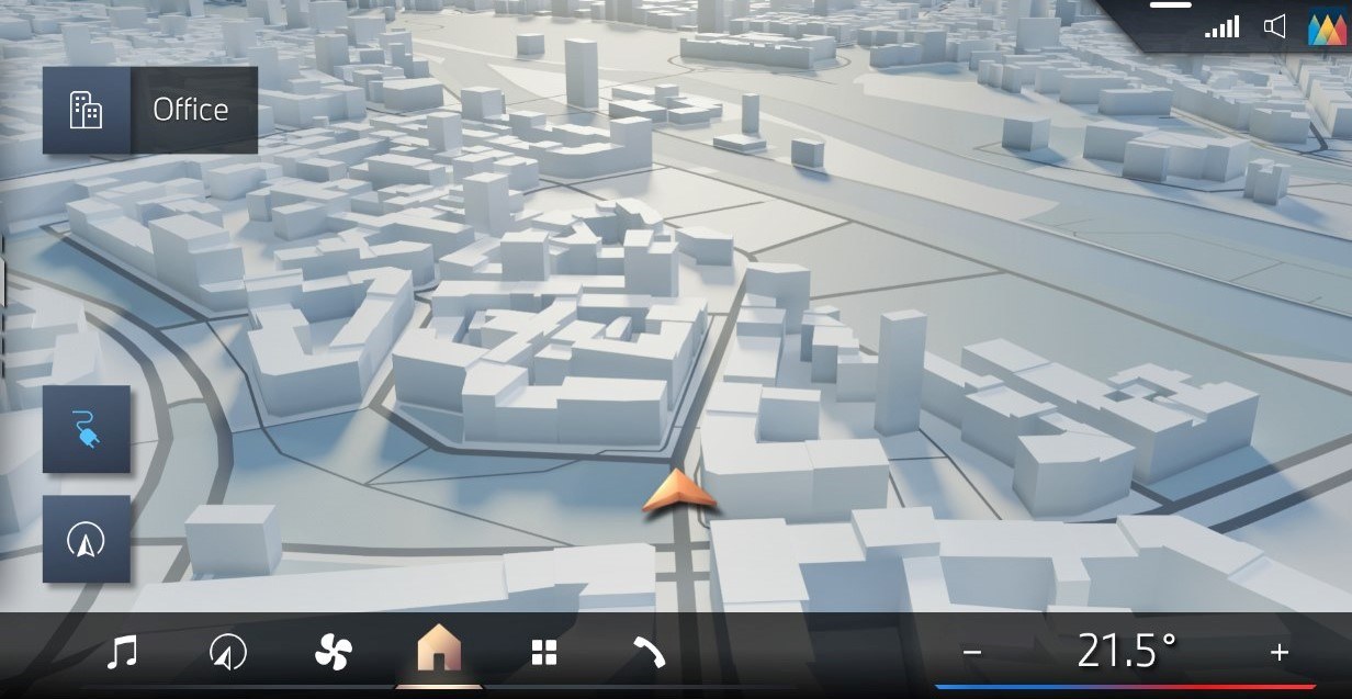
Now comes what would be considered the ninth generation of the iDrive system which will be gradually introduced in current models from this year. New features and improvements include a new home screen with clearly arranged functions, and an improved menu structure.
“Today, BMW iDrive is more than just a control and operating system – it’s a digital world of experience allowing human and car to interact with one another and exchange information,” said Stephan Durach, Senior Vice-President BMW Group Connected Company Development. “We are continuously enhancing the associated user experience based on the latest available technology. This translates into a broader offering of digital content for information and entertainment, shorter function update cycles, better information on charging points for electric vehicles and improved access to a host of specific online services.”
With its new graphical interface and optimized menu structure, the iDrive will in future focus even more squarely on interaction by using the touchscreen and natural language. The BMW Curved Display will continue to serve as the point of interaction for the multi-sensory iDrive experience.
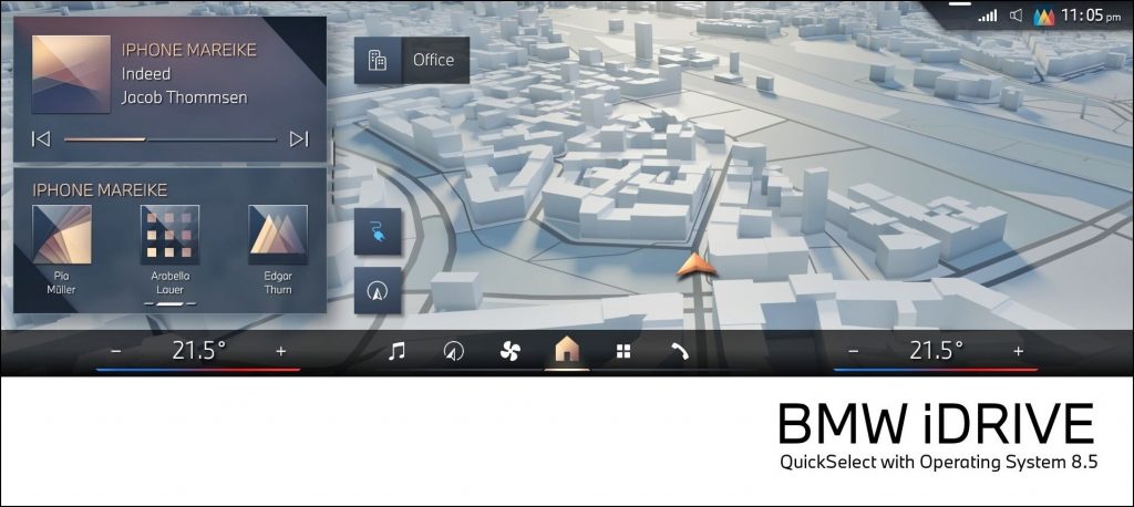
The new iDrive turns the home screen on the BMW Curved Display into a permanently viewable user interface. Other individually configurable graphics can also be displayed here at all times as an alternative to the navigation system’s map view.
The new zero-layer principle means that all relevant functions and information are shown on a single level, making it possible to select a desired function without having to enter a sub-menu first. Instead, live widgets appear in a vertical arrangement on the driver’s side of the user interface. These function icons can be selected with a swipe of the finger and also configured individually.
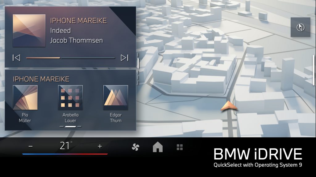
The QuickSelect functionality makes it possible to directly select entertainment programmes, contact lists and vehicle settings, start interaction with the BMW Intelligent Personal Assistant or activate other menu options, all by touch. And once the relevant settings have been chosen, a quick tap on the home icon at the lower edge of the display is all it takes to return to the home screen.
The operating concept for the new iDrive therefore aligns with user habits established with today’s consumer electronics devices. The new, flat menu structure makes activating functions and settings much faster and simpler. The digital content is – just like the hardware, in the form of the BMW Curved Display – designed to enhance the driver focus with the right information in the right place and at the right time.

To ensure intuitive interaction whilst driving, the graphical interface and menu structure feature a layout developed by BMW Group Design that is both consistent and characteristic of the brand. As a result, customers are promised a signature BMW user experience at all times.
The digital experience on the specific BMW Curved Display of the compact-class models with the new BMW Operating System 9, based on Android Open Source Project software, is being developed.


