A number of companies, even global ones, have changed their corporate logo over the past year and Edaran Otomobil Nasional, a subsidiary of DRB-HICOM Berhad, joins them this month.
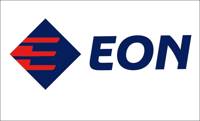
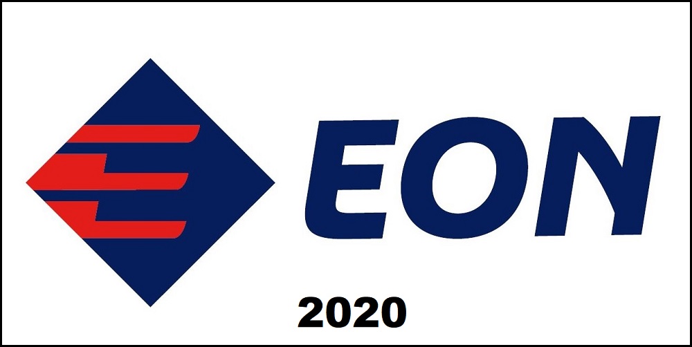
The new logo is the third one for the company, better known as ‘EON’, since it was established in 1984. The first change after that was in 1990. The new logo is a total departure from EON’s previous logo. It sports a stylised red ‘E’ that sits within a blue diamond, showing a forward-movement motion.
‘Coming of age’
The company’s acronym ‘EON’ also appears on a more modern font. The company says this signifies the brand’s coming of age after more than 30 years in the automotive distribution business in Malaysia.
The red ‘E’ is said to depict the boldness of the brand that retails a number of automotive brands in Malaysia. The blue diamond is a show of strength for the 36-year-old brand, as well as the typical traits that are associated with the colour blue: loyalty and wisdom.
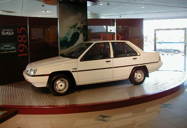
EON was originally established to handle domestic distribution and marketing of Proton cars. When the role was taken over by Proton Edar, which was a subsidiary of Proton, EON became a super dealer chain as it had the most Proton outlets in the country.
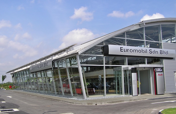
With the change in its role, EON took on other brands to represent, namely Audi, Volkswagen and Mitsubishi. The other brands are sold by subsidiaries of EON. Additionally, the company also operates the Avis car rental and leasing network in Malaysia.
9 Proton outlets
Along with the new logo, EON has announced the commencement of their Proton retailing business. EON now owns nine Proton dealerships, including four 4S (sales, service, spares and spray-painting) centres and three 3S outlets. Four branches are in the central region, while there are two each are in Johor and Penang. The outlets were formerly owned by Proton Edar.
LOOKING BACK – Remembering the birth of the Proton Saga and what it meant to the nation


