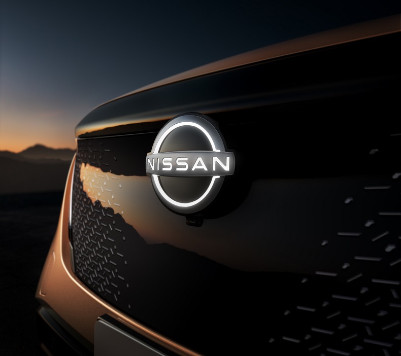
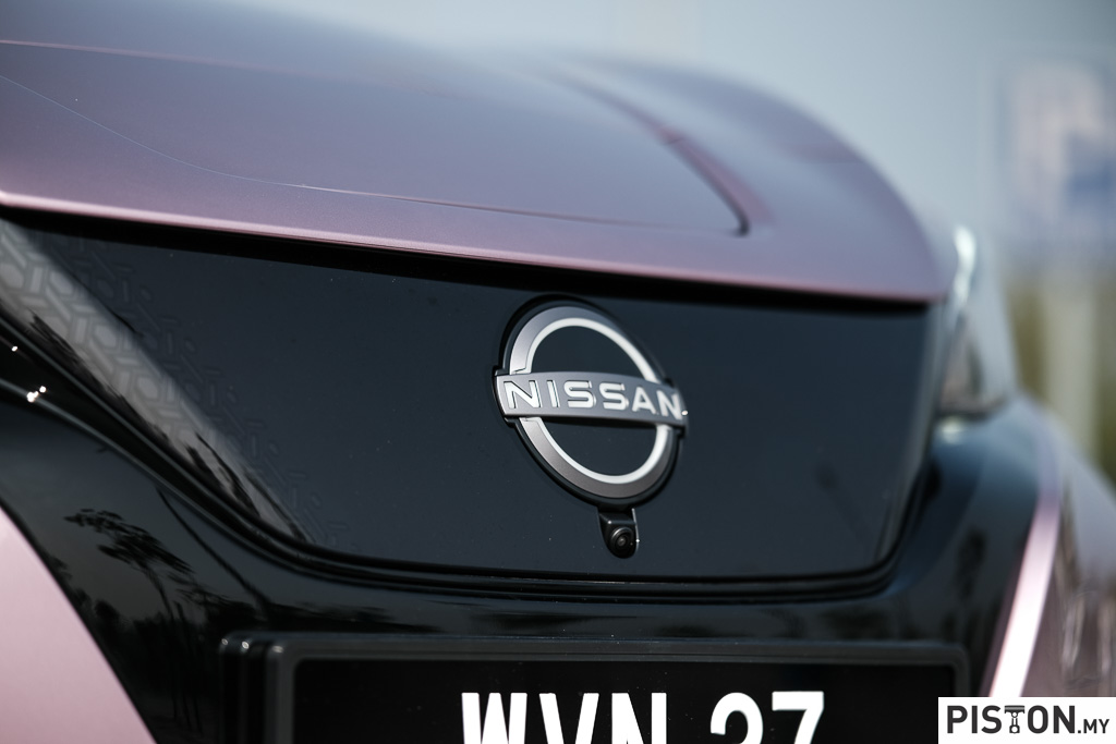
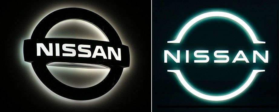
Logos or emblems are important and established companies pay particular attention to them because they identify the brand. Some logos may be used for decades but eventually evolve as times change – as what has occurred with the Nissan logo. It is a reimagination of the iconic Nissan brand logo for a new chapter, serving as a digital and physical trademark for a new generation of Nissan models.
Company founder Yoshisuke Aikawa followed the motto ‘Shisei tenjitsu o tsuranuku’ (If you have a strong belief, it penetrates even the sun) with Nissan’s logo. While keeping this essence alive, Nissan’s new logo reflects the significant changes in society over the last two decades.
The new logo points to the future and at the same time looks proudly at its rich heritage, at the tradition shaped by innovations, at milestones and successes back. The company name remains in the centre of the logo and thus underlines the recognition value.
The design process
The development of the new logo began in mid-2017 when Alfonso Albaisa, Nissan’s Senior Vice-President of Global Design, began to study potential changes to Nissan’s logo and brand identity. He set up a design team led by Tsutomu Matsuo, Deputy General Manager of Nissan’s advanced design department, to study everything from a subtle evolution to a complete reinvention. Albaisa offered the keywords ‘thin, light and flexible’, and set Matsuo and his team on their journey.
“Inspiration was drawn from breakthroughs in science, technology and connectivity… how these have brought fundamental changes to our customers,” said Albaisa. “As you can imagine, visions of digitalization started swirling in our heads.”
Over the next two years, the team sketched and plotted several versions, always keeping Aikawa’s directive words in mind: “be passionate, be an innovator, be a challenger.”
The team needed to consider several variables, including an early decision for the logo to be illuminated on upcoming all-electric models. This presented technical challenges, such as gauging the thickness and contour of the logo’s outline to ensure a crisp impression when lit and, of course, compliance with government regulations for illuminated elements on cars. The logo also needed to make a strong impression when not illuminated, such as when it appeared digitally or on paper.
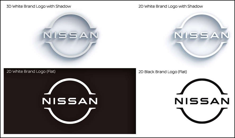
The result after countless sketches and several mock-ups was a logo with a two-dimensional character. It looks more designed than crafted and is therefore flexible enough for different areas of application. The Nissan designers first started three-dimensionally with the illuminated brand emblem before the 2D model was finalized.
Reflecting Nissan’s change
With the redesign, the edgy, industrial look was transformed into a finer, more familiar and digitally friendly model. This change also underlines the Nissan development from a traditional automobile manufacturer to a mobility service provider.
“The new Nissan logo communicates our guiding message, carried over from past iterations: If you have a strong, determined belief, it can even penetrate the sun,” said Matsuo. “At Nissan, this strong belief in the power of achievement has never wavered and can be seen in our pioneering efforts in electrification, driver assistance and digital connectivity. Our logo has to convey all of this in just a glance, to show our commitment to our customers, employees and society.”
Start of a new era
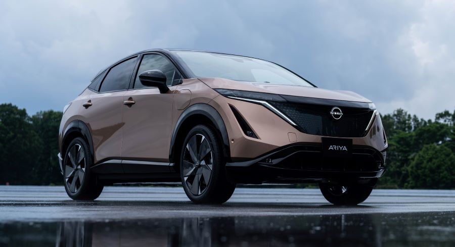
The new logo is introduced this month, both in digital and physical forms. All of Nissan’s electric vehicles will feature an exclusive illuminated logo lit by 20 LEDs (corresponding to the number of years between logo redesigns), a prominent visual reminder that Nissan is driving towards an electrified future. The first model with the new emblem is the all-electric Ariya crossover SUV unveiled recently.
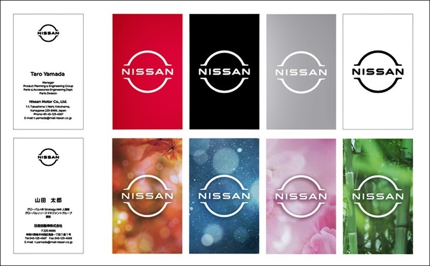
This will be followed by the new logo being incorporated widely, from stationery letterheads and dealership signs to social media and digital advertising. Different versions allow flexibility for different communication needs.
In certain digital and video applications, the logo even becomes ‘alive’, ‘pushing’ itself against various backgrounds and pulsating. The logo thus reflects today’s constantly changing environment and the flexibility required to be exciting, relevant and fascinating stay.
At Nissan dealerships, the new logo will first appear on displays and screens. The conversion of the outdoor signs and the showrooms to the new visual identity of the brand will start in November 2020. The new Nissan logo will be visible on the outside on a simplified slim tablet above the entrance. The characteristic dark gray paint can only be found on the main facade and visible side facades and the signpost is no longer required.
Visit www.nissan.com.my to know more about the Nissan models available in Malaysia.
Volkswagen and Audi modify their logos to create social distancing awareness


