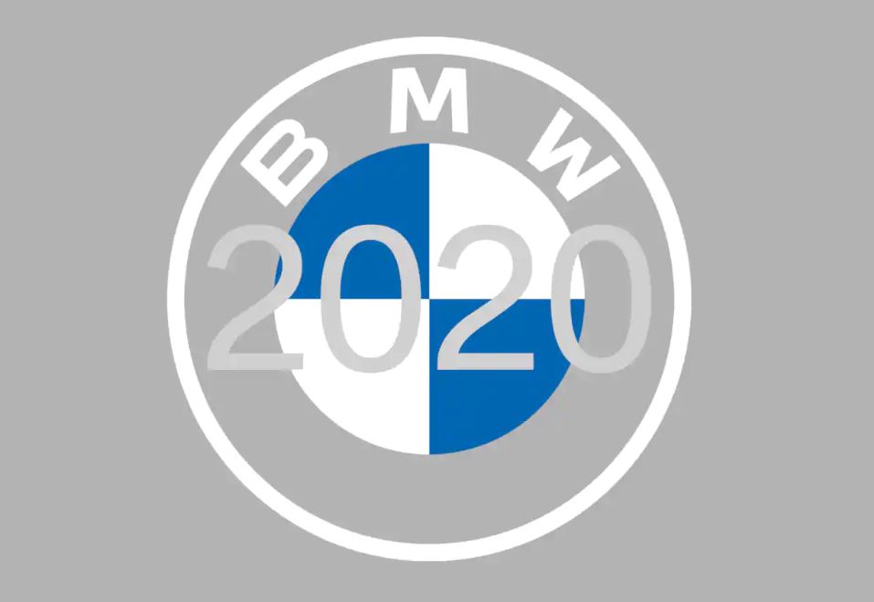
After more than 20 years, the BMW brand has a new corporate identity for online and offline communication purposes. The BMW, BMW i and BMW M communication logos have been completely reworked, with a new logotype and new design principles. According to the company, it has ‘the visual style of today and is better-suited to the digital age’.
The new design is described as an expression of the revised brand identity, which places the customer at the centre of all activities. More minimalist in a sense and two-dimensional, it conveys openness and clarity. The additional transparent version of the logo is a more open invitation than ever for customers to join the world of BMW. The change reflects BMW’s transition from centering purely on the automotive world to being about technology and connections.
The redesigned logotype expresses openness and strength of character to ensure a contemporary, future-proof presence both online and offline.
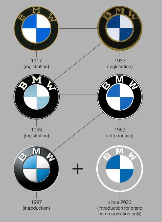
The origins of the ‘BMW propeller’ design
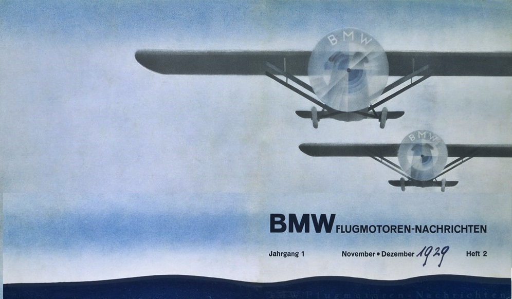
The fundamental elements of the BMW logo are its colours: white and blue, which are the colours of the state of Bavaria in Germany, home of BMW. The myth of the ‘BMW propeller’ actually began 91 years ago with aA BMW ad showing an airplane with the BMW logo in the rotating propeller. At the beginning of the global economic crisis, the ad was trying to promote a new aircraft engine that BMW was building under licence from Pratt & Whitney. The propeller interpretation fit very well into the advertising image of the young company, as it underlined the company’s roots and its expertise in aircraft construction.
Then, in 1942, BMW itself linked the propeller to its company symbol. An article appeared in a BMW publication called ‘Flugmotoren-Nachrichten‘ (Aircraft Engine News) which backed up the story of the BMW badge as a spinning propeller. The story was illustrated with a photo of the BMW logo overlaid on a rotating propeller.
“For a long time, BMW made little effort to correct the myth that the BMW badge is a propeller,” explained Fred Jakobs of BMW Group Classic. So according to the expert, sticking to the story that the BMW emblem is a propeller would not be entirely wrong. It’s not strictly true that there is a propeller in BMW’s company logo, though. Constant repetition has made this explanation a self-propagating urban myth. “This interpretation has been commonplace for 90 years, so in the meantime, it has acquired a certain justification,” Jakobs said.
New logo stands for openness and clarity
“BMW is becoming a relationship brand. The new communication logo stands for openness and clarity,” explained Jens Thiemer, Senior Vice-President for Customer and Brand BMW. “We want to use this new transparent version to invite our customers, more than ever, to become part of the world of BMW. In addition, our new brand design is geared to the challenges and opportunities of digitalization for brands. With visual restraint and graphic flexibility, we are equipping ourselves for the vast variety of touchpoints in communication at which BMW will be present, online and offline, in the future. This additional communication logo symbolizes the brand’s significance and relevance for mobility and driving pleasure in the future.”
The global launch of the new brand design starts this month and progressively up to May 31, 2021, it will begin to appear in all communications, on and offline, and for international trade fairs and events.
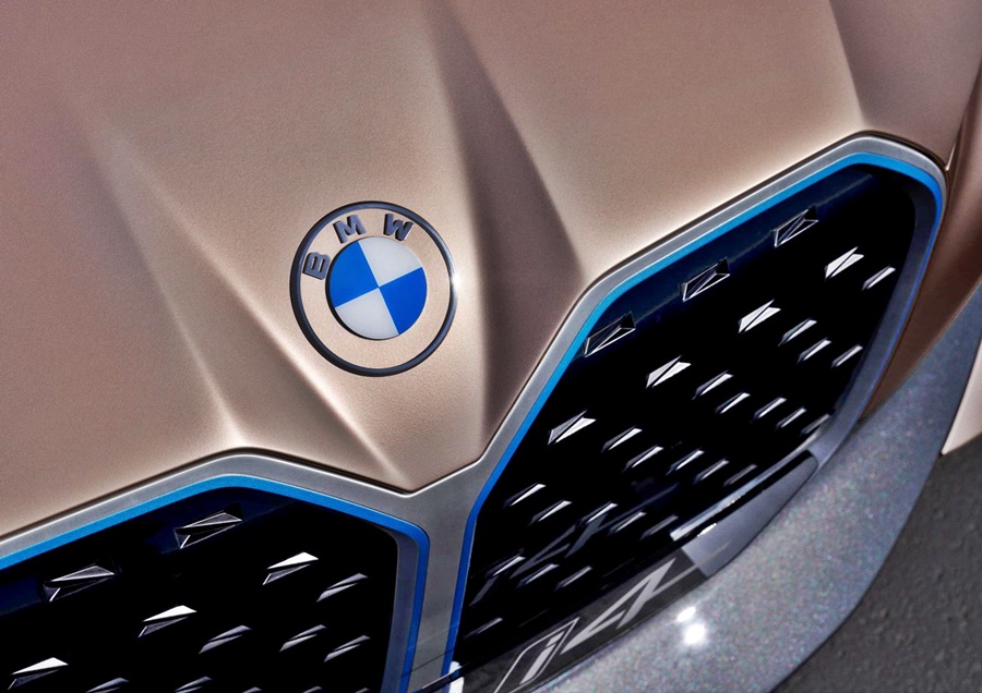
BMW clarifies that the new logo is a new media branding and will be used in addition to the existing logo. It won’t be used on the vehicles or feature on the exterior and interior of dealerships. However, it seems that concept cars may use it, as evident in the BMW Concept i4 unveiled recently.


