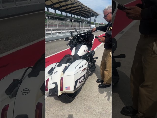
When Soichiro Honda began making motorcycles, the logo which he chose as a brand mark had wings, and this was inspired by a sculpture of the goddess Nike (the ancient Greece goddess of Victory) which he saw. Over the years, from the 1950s onwards, the Honda Wings would evolve while maintaining the same side view.
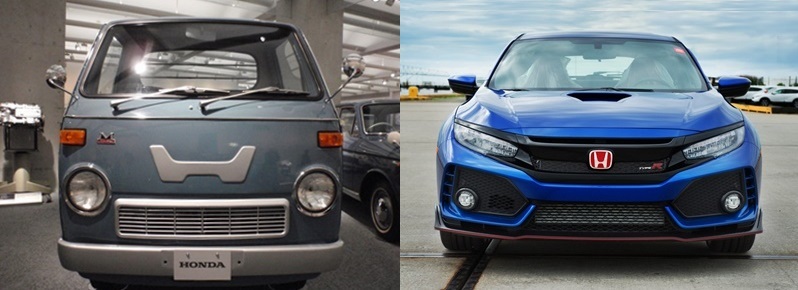
For automobiles, which began in 1963, the brand logo did not use the wings as a basis but a simple ‘H’. This was prominently placed on the front of the T360 mini truck, Honda’s first automobile. The shape of the ‘H’ was trapezoid with the top wider than the bottom. It is believed that this was intended to look like ‘reaching for the sky’ – well known of Honda, the ambitious founder.
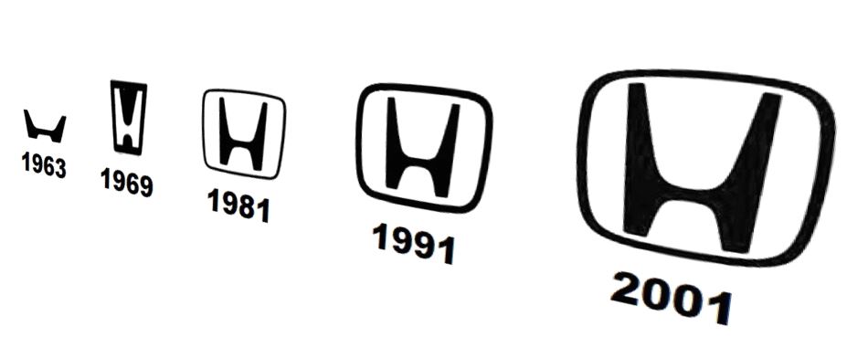
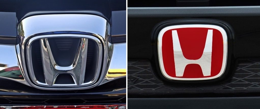
Apart from a few variations in size, the logo design has remained unchanged for over 50 years. It has been finished in silver (or grey), black on some models and for the Type R versions, the background has been in red. In earlier years, when the brand was still young, the HONDA name was inserted below or within the ‘H’ but over time, this became unnecessary as Honda became well known all over the world.
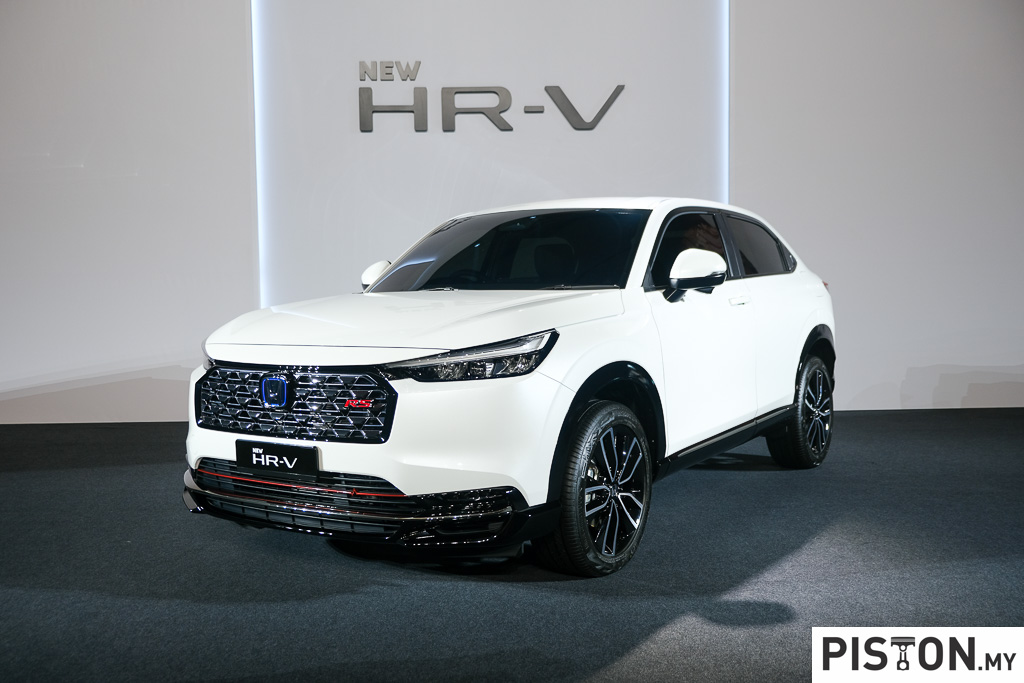
Here’s a collection of the different badges on grilles over the years, starting from the first one on the T360 in 1963. They are not in chronological order but show the way the ‘H’ has changed from its broad presentation to a tall and slim one today.
Visit www.honda.com.my to know more about Honda models available in Malaysia.


